
Summary
The Compare Metrics dashboard allows you to explore the relationships between different metrics. View trends in up to three metrics for the past three years on the same chart. Use it to:
- Understand your key customer KPIs over time without having to switch metrics.
- See how factors such as on-shelf availability and price have impacted sales.
Setting up the dashboard
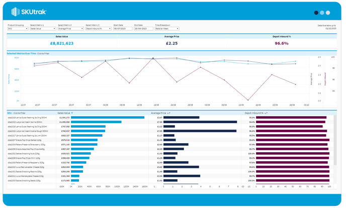
The dashboard gives you seven configuration options in the top bar, from left to right:
- Product Grouping: change whether the bottom-left bar chart shows Categories, Subcategories, or Brands. The default setting is Category.
- Select Metrics: Choose up to three metrics to display on the screen.
- Select Metric 1 will be shown in dark grey.
- Select Metric 2 in navy blue.
- Select Metric 3 in orange.
- Start Date: Set the start date for your window.
- End Date: Set the end date for your window.
- Time breakdown: Set the time breakdown to view the data by Day, Retailer Week, Calendar Week or Calendar Month.
What's on screen
There are three types of components on-screen, from top to bottom:
- KPI tile: the KPI summary tiles along the top show the totals for the selected metrics across the selected date range.
- Time series: the time series across the middle of the screen shows your selected metrics across the selected date range. To explore outliers or interesting dates, simply click on a date or drag to select multiple dates, which will filter the rest of the dashboard
- SKU breakdown bar chart: the bottom bar chart shows three bars representing each selected metric.