
Summary
The Store Over Time dashboard lets you explore performance at the store level. See how products are performing across store groups and regions and drill right down to individual product-store combinations.
-
Explore performance trends in your products and stores
- Easily find your top selling or wasting stores and products.
Setting up the dashboard
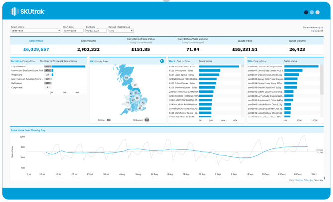
The dashboard gives you three configuration options in the top bar, from left to right:
- Select Metric: Choose which metric to view on the dashboard. Select between, Sales, Rate of Sale or Waste.
- Start Date: Set the start date to view the dashboard.
- End Date: Set the end date to view the dashboard up to.
- Ranged/Not Ranged: Filter down to stores that are either ranged or not ranged - If Stores Ranged in unavailable for the retailer, Stores Stocked is used instead.
💡 The default calculation for the Rate of Sale KPI is based on stores ranged. However, this can be overridden by selecting the relevant rate of sale metric from the dropdown menu, choosing between Rate of Sale calculated using stores ranged or Rate of Sale calculated using store stocked.
What's on screen
There are three components on-screen, from top to bottom:
- KPI tiles: at the top of the page show your headline figures for the selected date range.
- Breakdowns: there are three breakdowns on screen in the centre of the page.
- Format breakdown: the first breakdown is format level. The bar shows the selected metric and the grey box shows the number of stores in a format
- Store breakdown: the bar shows the selected metric for each store.
- Product breakdown: the bar shows the selected metric for each product.
- Map: between the format and store breakdown is a map, broken down by each region. The number of stores in each region is shown in the circle and the region is coloured in a blue scale by your selected metric. Click on the region to filter down to the Stores within the region.
💡 To reset the map, click the reset icon in the top right-hand corner of the map.
- Time series: The time series shows your selected metric for the selected date range. The blue line represents the selected metric by day, while the light grey line shows the rolling 7-day average.