
Summary
The Top Line Report helps you understand what's driving performance by visualising trends in all of your metrics. It's densely packed with information and a fantastic source of insight into how your account is performing. Use it to:
- Gain a one-page summary of your account's performance
- Understand how different influencing factors are impacting sales
Setting up the dashboard
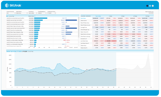
The dashboard gives you four configuration options in the top bar, from left to right:
- Product Grouping: change whether the top-left bar chart shows Categories, Subcategories, Brands or individual SKUs. The default setting is SKU.
- Select metric: changes the metric used in the top-left bar chart and bottom time series. The default setting is Sales Value.
- Time period: the time period to be used for comparison in the top-left bar chart and bottom time series. The default setting is Year to Date.
- Comparison time period: the period selected to compare against in the bar chart and time series. The default setting is FY 22/23. If 'Previous' is selected, the selected time period will be compared against the directly preceding period of the same length.
What's on screen
There are three components on-screen, from top left to bottom right:
- Product breakdown bar chart: the first bar shows the total for the primary metric over the chosen time period. The second bar shows the variance between the chosen time period and the comparison period.
- Metric table: the table shows all metrics over each available time period. The total for the selected period is shown, along with the percentage variance from the comparison period.
- Time series: the time series shows the primary metric over the chosen period. The latest period is a blue line, and the comparison period is a grey-shaded area.